Albany Airport
Landing the Albany Airport account was a game changer for Vibrant Brands since moving offices from western New York to the Capital Region. The relatively small agency beat out some much bigger firms in major markets for the chance to redesign the regional airport’s branding. It was important that this project be exceptional and buttoned up.
Approach
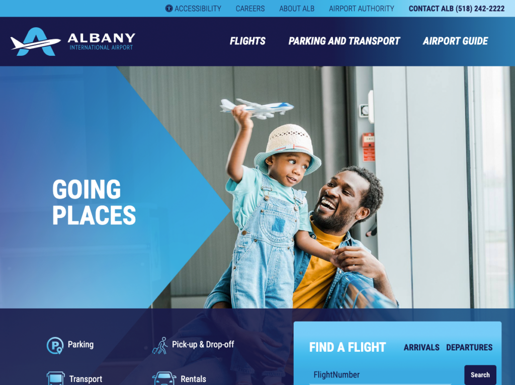
Working closely with the excellent designer Chris Steckline, I created a web site that used animations and unique effects to convey a sense of movement. The imagery was modern but also conveyed a sense of relaxation, even fun. The idea was to distinguish the airport experience from the larger airports of the New York City area. Flying in or out of Albany Airport is a far more relaxing experience than JFK or LaGuardia. We wanted the site to reflect that relatively relaxed vibe.
“The Vibrant team presented us with a top-notch web design and completed the project ahead of deadline. I appreciated their input and professionalism.”
Walter Porinasell, Director of Development
Process
I created a number of animations to review with Chris and we decided on the ones that were eye-catching without distracting from the information provided or creating issues with the user interface. Different types of animation call attention to areas of content, happening quickly to ensure users can traverse the site with ease.
Being an airport, it is quite likely that users will be trying to gather the information they want on all manner of devices. It was imperative I make the site fully repsonsive and that all info was visible on any device. I employed best practices of web optimization to ensure the site would load quickly on what might be spotty WIFI. Images had to be reduced as much as possible without losing quality. Scripts had to be minimized, server calls had to be reduced. Accessibility was of the utmost importance.
The end result was a contemporary-looking site that captures the spririt of our area while providing important information.

